"Captain MElon on a Mission"
Context: UI for our 4th Semester project (Jump n Run Puzzle game in a toy story setting)
Name: Captain MElon on a Mission
Link: https://aimeejacob.itch.io/captain-melon-on-a-mission
Time: 2 Weeks
Goal: Create a User Interface in a cardboard style
Programs: Maya, Photoshop, Unity
Game Description:
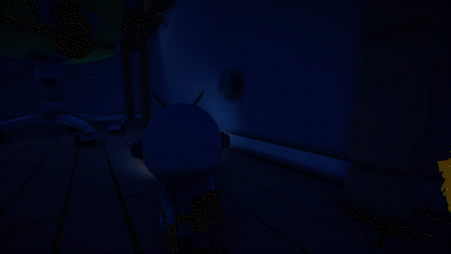
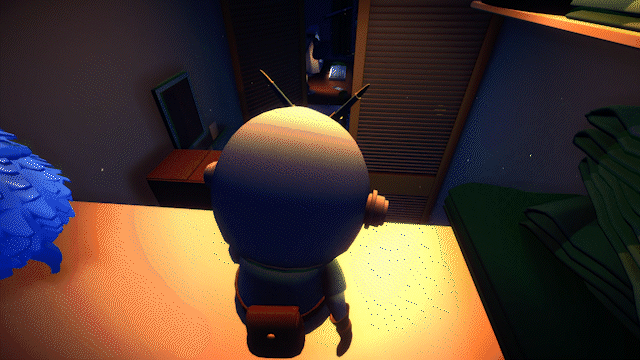
"Captain MElon on a Mission" is a charming 3D third-person puzzle platformer set in the early 2000s. Take on the role of a toy astronaut puppet, determined to escape a child's room through an air vent atop a closet.
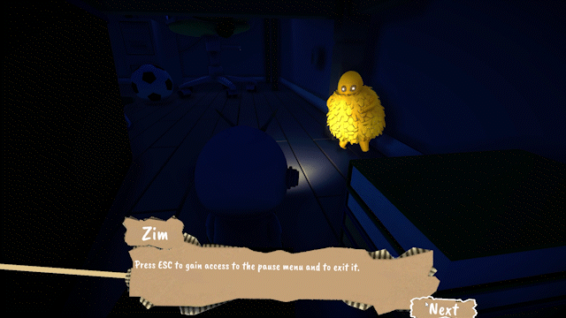
Navigate through intricately designed platforming levels, overcoming obstacles and collecting hidden items along the way. As you embark on your journey, you'll encounter three friendly NPCs, toys reminiscent of the early 2000s era. These toy brothers will challenge you with quizzes that must be solved to progress further in the game.
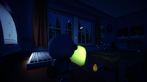
The game's visuals, combined with soothing background music, create a sense of familiarity and mystery. Set during nighttime with the gentle sound of rain outside, the game evokes a nostalgic feeling. The unique puppet theatre aesthetic enhances the experience. The user interface, as well as the story-driven cutscenes, feature cardboard cutouts as buttons and icons, adding a charming and imaginative touch to your interactions.
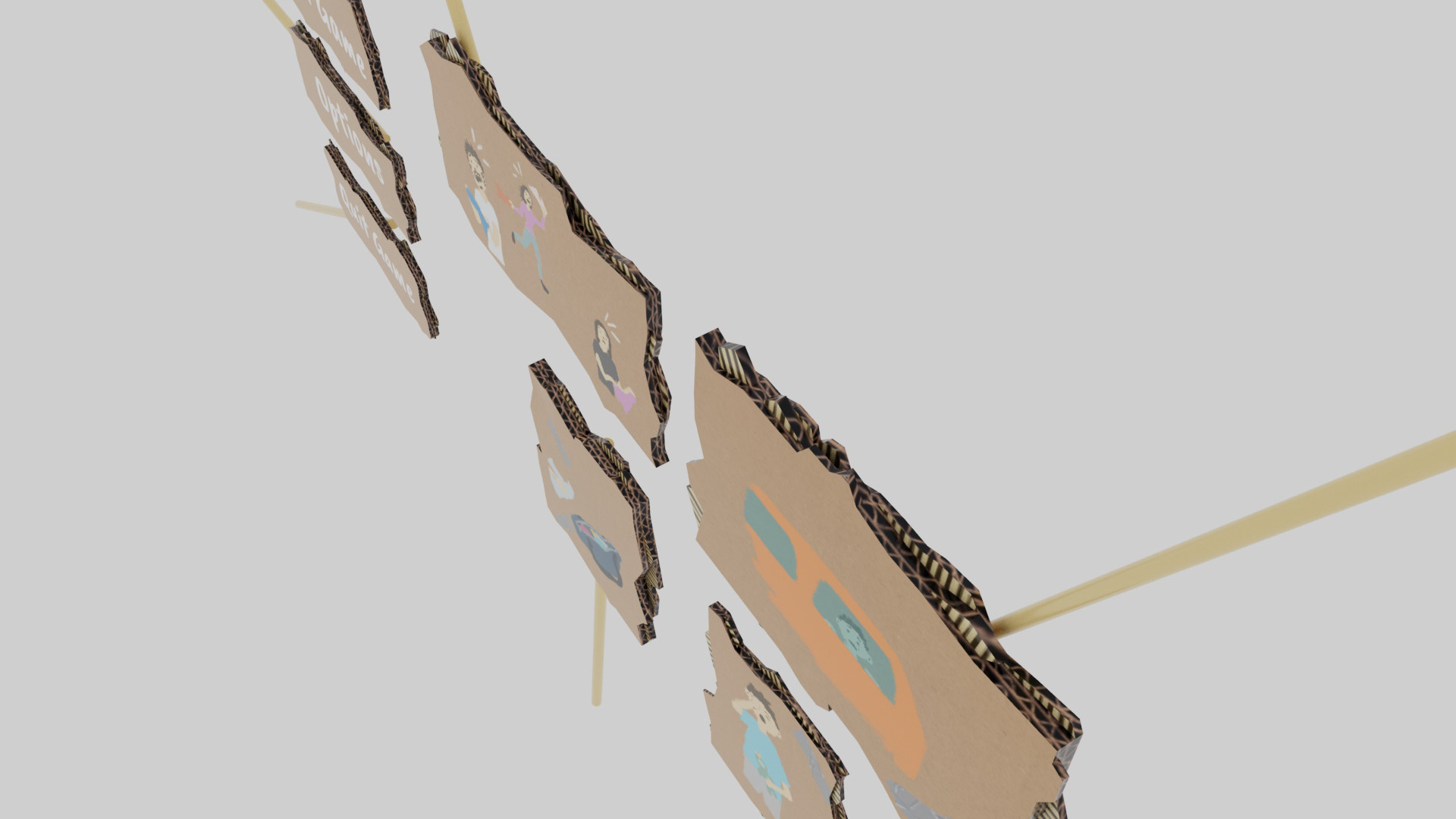
For this project, I wanted to create a User interface completely made out of cardboard cutouts. The theme for the entire UI was a puppet theatre. The challenge here was to make it look like a child cut out the cardboard pieces and drew on them with crayons but also make it look good and readable at the same time. i decided on a few design guidelines:
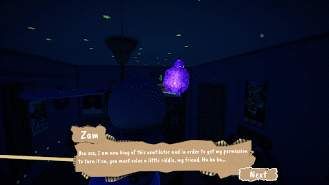
1. Every Ui element in the game should be a cardboard cutout and connected to a wooden stick. The game is a Very story-driven dialogue-heavy game. So To make these rather dry parts more interesting and interactive for the player I decided that it would be fun to design the Ui in a Puppet theatre type of style. This further emphasizes the idea of the player playing a Story rather than a game and also gets him engaged with that Story.
2. Every Ui element has to move organically so that it feels like someone is holding the UI elements up for you like in a real theatre where the actors are hidden behind a curtain or box.
3. All icons and Ui images should be drawn with a crayon brush to give them a more child-like feel. This was firstly a design decision since it would make sense to put a fully rendered graphic on some worn-out cardboard cutouts but also it was a story decision since the perspective the player gets to view the story from is a very child-like perspective playing as a childres toy
Main Menu


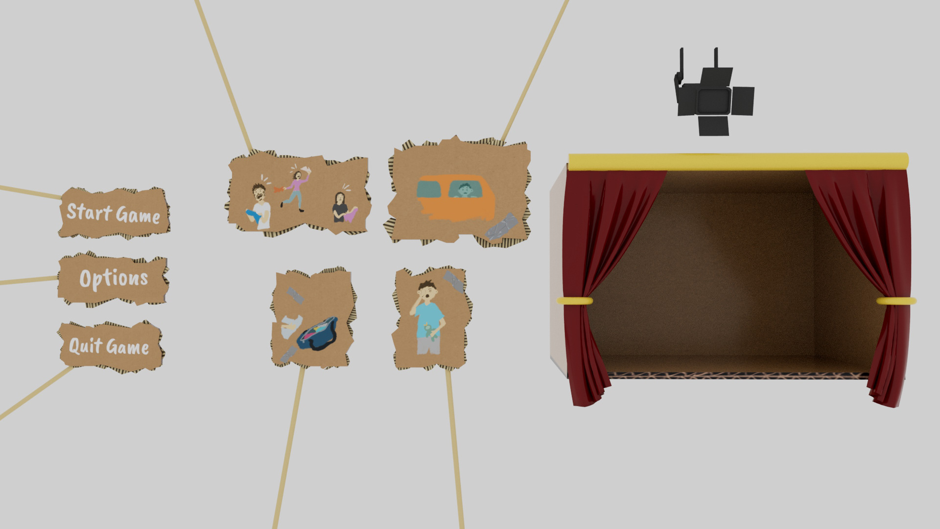
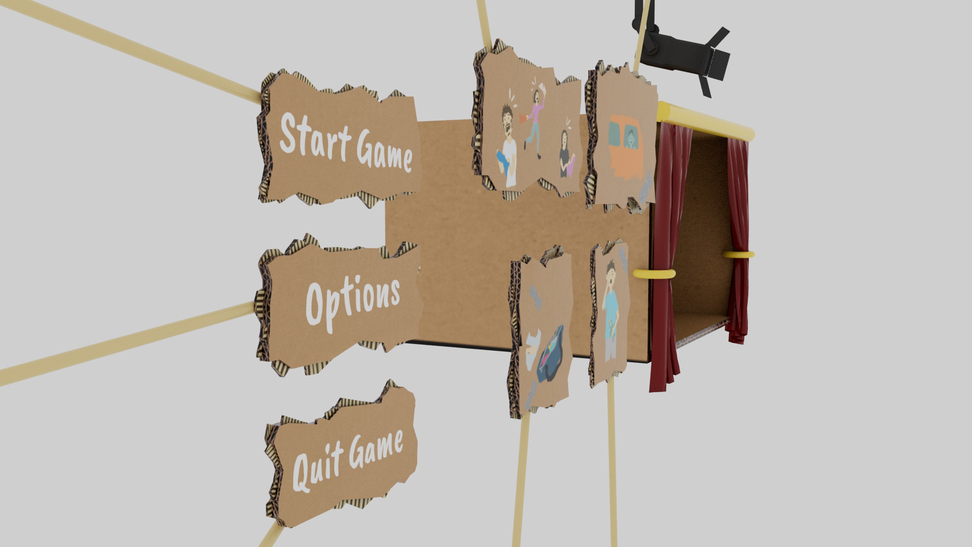
The team and I were really struggling with finding an idea for an interesting main menu. We didn't want the standard 2d text menu with a 2d background. So I had this idea of making cardboard cutouts, we all liked that since it would not only create a sense of familiarity (we all played with cardboard when we were children) but also make the Ui look cute and unique. I knew that the cardboard cutouts should be connected to a wooden stick since I wanted them to move around organically.
The idea of holding up a cardboard cutout to convey an idea or story to an audience reminded me of a puppet theatre where the moving elements are connected to strings. So I pitched the idea to the team and they loved it. This Concept was also perfect for telling our very important story since it is a story-driven game after all.
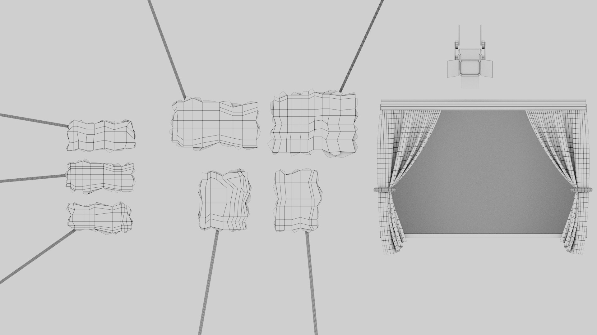
I then immediately jumped into Maya to create the 3d models for everything. After UV mapping the models, I created the cardboard texture in Photoshop using some stock images and also drew the cutscene pictures with a crayon brush. Then I put everything together in unity and started playing around with the lighting.
Since we now had decided on the puppet theatre theme I wanted to incorporate light to convey hierarchy in the Ui. Everything that the Spotlight touched was of more importance than the buttons in the dark.
And as it turned out I was spot on with that idea, the whole team and all the testers loved this use of light.
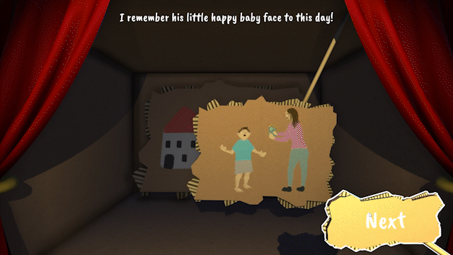
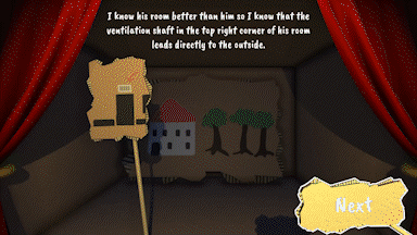
Story Cutscenes

Loading Screen

Ingame UI
Interact

Inventory


First Mockup of Ingame UI

First Mockup of Inventory

2nd Version
The first inventory placeholder Ui was just white outlines but the players found that quite boring. At this time in development, we also had the question always being displayed. I decided that the quest log and inventory should only be visible when needed and also should be visible together so that the player only has to remember one key to see all the important Ui elements.
The quest log in the inventory took up to much-unneeded space since there were only two objectives to complete in the game. And after not finding a place to display the collectibles that each level has I just decided to cut the quest log space in half and give the bottom half to the collectible counter.
Pause Menu

The players liked the movement of the UI but many were annoyed that even the options UI was moving since it was really frustrating for them trying to click on one of the options or one of the slider handles while the menu was constantly moving back and forth. So I slowed the movement down in the menus and in general when you needed to click on something with your mouse.
Dialogue

Quiz UI