"Thief In Transit"
Context: UI for our 5th Semester project (1920s Stealth Game in an Arctic Train setting)
Name: Thief in Transit
Link: https://ren1.itch.io/thief-in-transit
Time: 2 Weeks
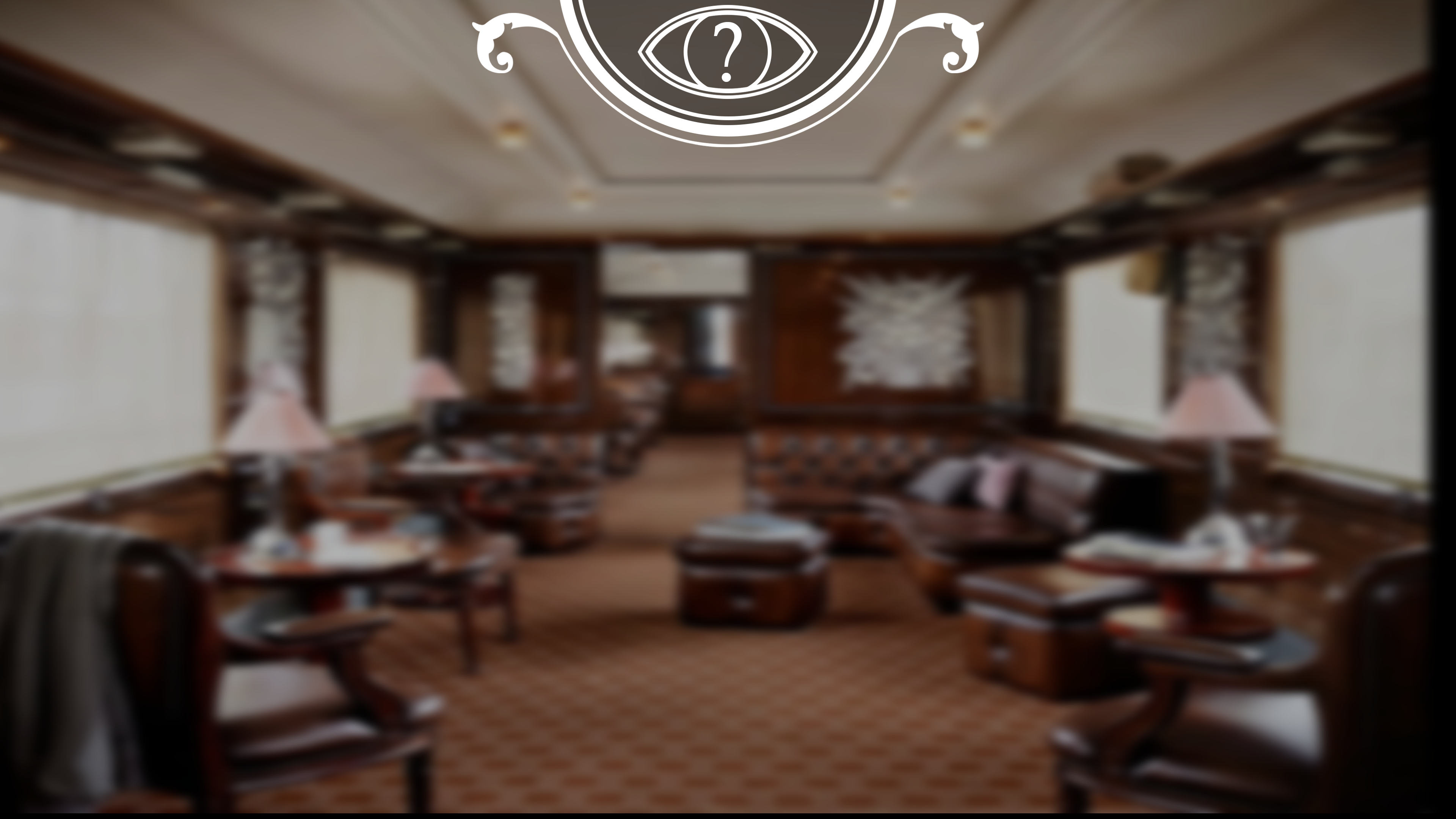
Goal: Create a User Interface in 1920s Art-deco Style
Programs: Photoshop, Unity
Game Description:
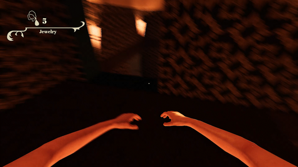
"Thief In Transit" is a First-person game set in the 1920s. Play as an orphaned protagonist on a mission to steal jewelry from rich passengers aboard an opulent train that traverses a ROute from London to Vancouver, passing through the North Pole. Evade the Ticket Inspector by running, hiding, or sneaking through the compartments.
The gameplay revolves around a combination of stealth, quick thinking, and strategic decision-making. You have the option to run, hide, or employ your sneaking skills to avoid detection by the inspector. However, it's important to note that any suspicious behavior, such as running or hiding, can draw attention from observant passengers. Your Attention meter will rise if they witness your actions, increasing the risk of the inspector being alerted to your presence.
When it's time to execute a theft, you'll engage in a quick-time event that requires precise timing, intensifying the gameplay and adding a thrilling element to your attempts at acquiring jewelry.
For this project, I wanted to create a 1920s-style UI using the Art-deco style. That means many geometrical forms, parallel lines, and ornaments. The challenge was: How do you make a simple straightforward Ui using a very ornate art style with many unnecessary aesthetic elements?
I decided on a few design guidelines:
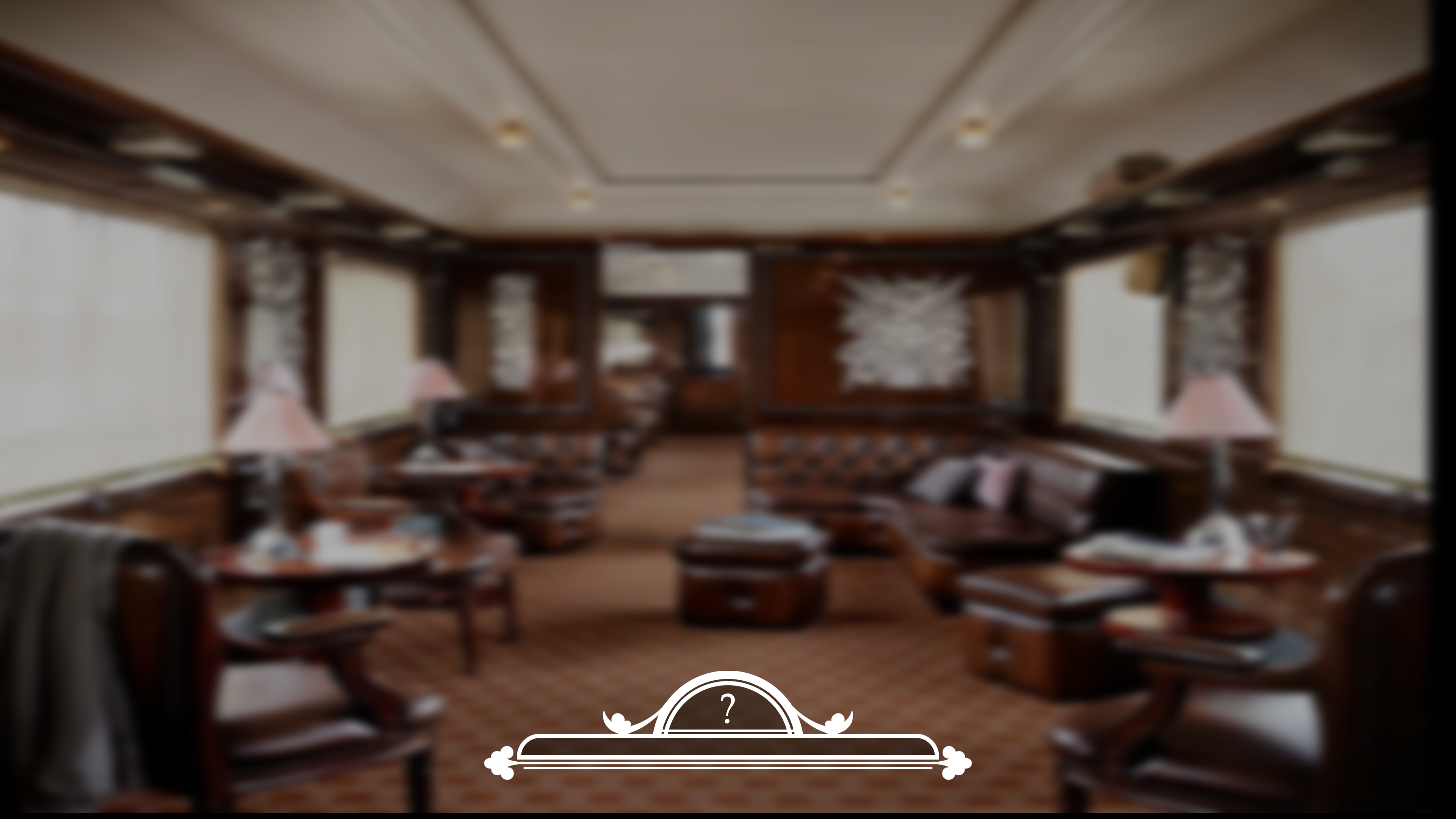
1. Maximum 2 parallel lines For functionality. (When you have a lot of parallel lines That accentuate the "box" or confinement of the design, often the "Key point" or content of the box loses significance)
2. Ornaments should only be used to accentuate the Ui not be part of it (The essential Ui elements should be very clearly readable to not confuse the player)
3. The UI should be off-white in order for the Ui to stand out from the background which contained a lot of yellows and golds which were typical for the art deco style back in the day.
4. the Ingame Ui should only be visible when needed. when stealing an item, you should be able to see the money counter go up but if you are not, it shouldn't be needed. if you do want to know you can just press the Inventory key to see all important Ui elements. This is because I didn't want to overwhelm the player with all of the small UI elements that are only important in specific situations.
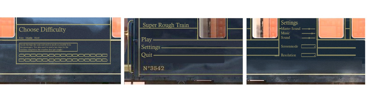
Main Menu


The team and I decided early on in the development of the game that we wanted a 3d main menu. The first concept was a child standing at a train station and the menu buttons being the signs hanging from the top of the Railroad station. We discarded that concept since we would have to create a whole 3d environment just for the main menu.
Then I came up with the concept of making the main menu a print on the side of a train after looking at the "Orient Express" and its exterior design. So then I concepted this idea and liked it very much since the movement of the train when pressing buttons would add a sort of eye candy for the player. This concept also was much more resourceful because I only had to model a train and not a whole Railroad station. Then I started modeling the train and painting it in substance painter.
The whole Ui was done in Photoshop and put into a Worldspace canvas on the side of each train compartment. Then I put the camera into place and just moved the train along the camera whenever a button was pressed.
Ingame
Tutorial Texts

The Tutrial Ui, which is the most important Ui for new players was just supposed to be simple Textboxes that only pop up once to not overload the player with textboxes every time he backtracked into the area. But if the player missed them or wasn't fast enough to read them we wanted him to have another option of figuring out the controls without going into the options menu.
The team and I decided to split it down into 2 types of tutorial UI. The first are the text boxes that pop up every time you enter a trigger and the second are the crayon drawings all over the tutorial area.
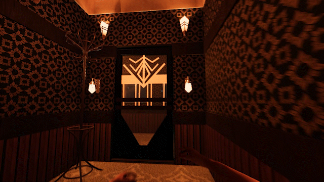
Pause

I wanted to capture that same "Eye Candy" Moving Ui in the pause like in the main Menu Creating an Imaginary bridge that connects the Main menu with the Pause Menu. Firstly to further emphasize the design Concept I choose for all the menu UI elements. and also to make the Pause menu more interesting.
I chose the same style of buttons with the 2 parallel lines displaying all the action. I like to think of them like eyebrows that convey emotion through movement.
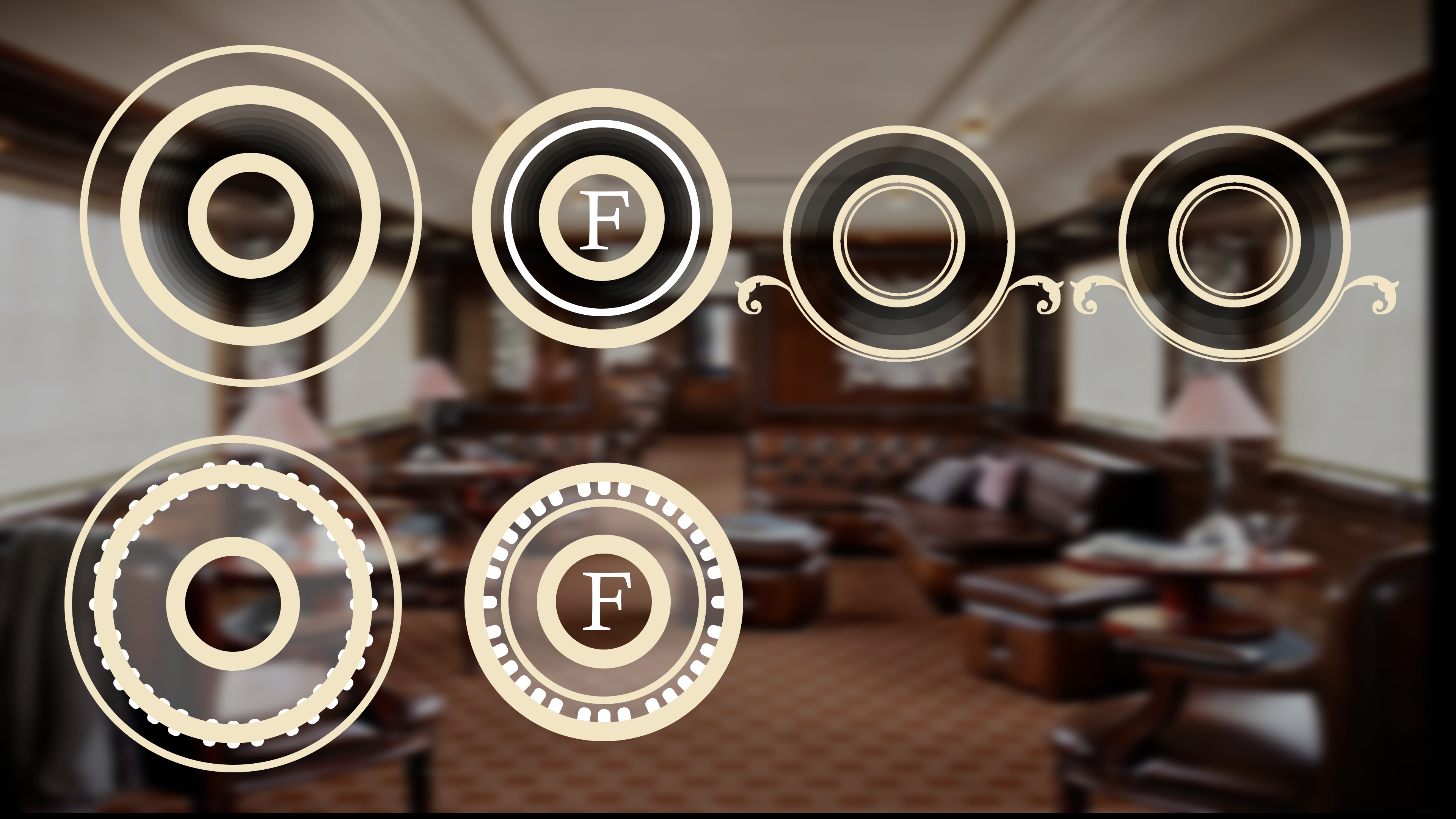
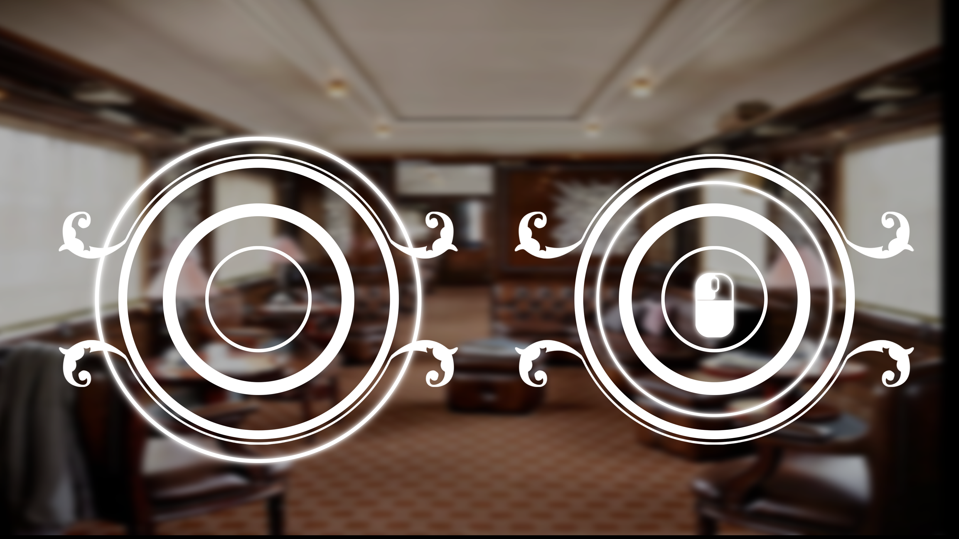
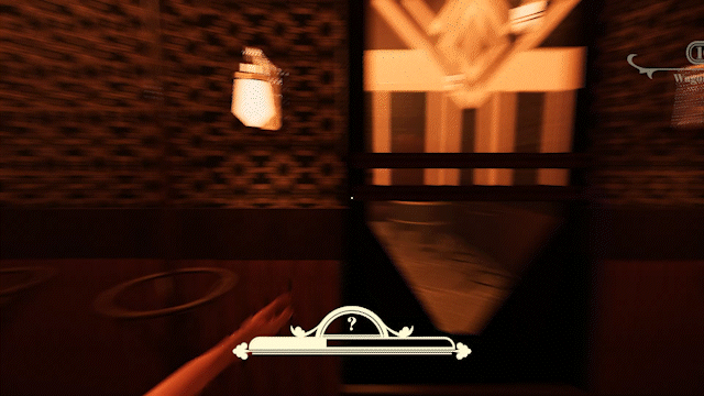
Stealing

The Quicktime event was too slow and players lost motivation when they saw a lot of jewelry laying around because they didn't feel like waiting for the quick time event to appear and narrow down every time. Even if it's just a few seconds more, it adds up at every interaction and slows down the flow of the game. So I made it faster and let the Ui appear quicker which also made it a lot snappier.

1st idea for the stealing quick time event
A few design Iterations
Last version (But we decided to take away the top ornament)
After discussing with the team what we wanted the quick time event to look and feel like I made a few concepts and let them and a few testers decide which one they like the best. After we decided on a version that we liked I started to further detail that version.
I played around with ornaments and highlighted the action elements in the UI like the moving circle. A big topic of discussion was the tutorial icon explaining to the player what button to press.
I had a few options:
1. The Icon is always visible
2. The Icon is just visible when the Circle is entering the trigger area.
3. Only make the Icon visible the first time the Quick time event appears.
We disregarded the 3rd option for the obvious reason of the player not paying attention and not catching the tutorial. We discussed and tested the 1st and 2nd options a lot. As it turns out the player paid more attention to the Quicktime event when the icon appeared since it would give the player visual feedback of when to click whereas the player really only had a clue of what to do in the 1st option because of past experiences with similar puzzles in different games.


The jewelry counter is Also part of the stealing Ui. But since I didn't want to go to fancy on all the low Hierarchy UI elements I really just stayed with the first concept and cleaned it up to fit into the Ui style of the Game.
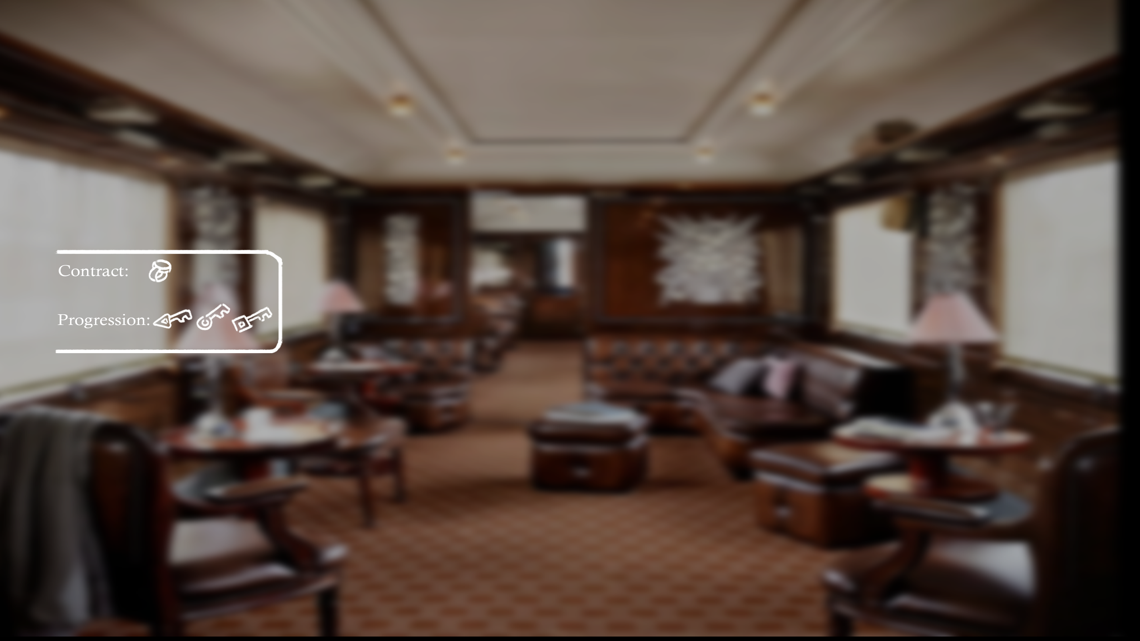
Inventory

1st rough sketch
Clean version
The inventory and Questlog need to be easy to understand and really just be straightforward. No extra aesthetics are needed so I decided to split them up into two Ui elements, one on the right and one on the left separating Queslog and Inventory. reducing potential confusion.
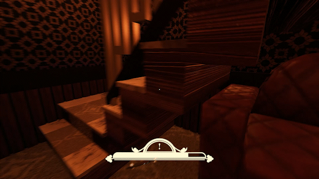
Attention Meter

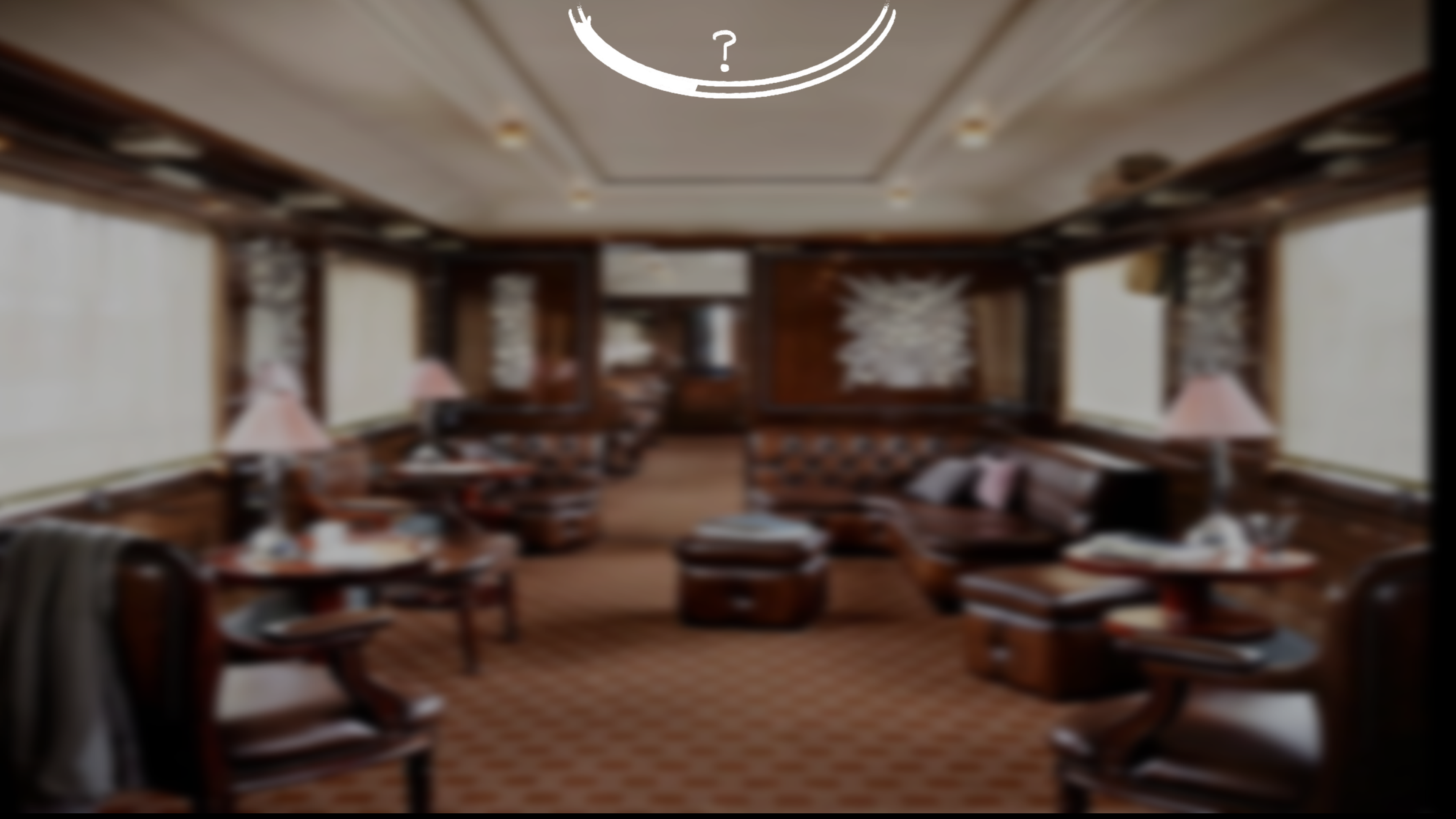
1st rough sketch
Attention meter at the top
Final version as a more straight forward bar
The Attention meter was taking up to much space on the Screen and was too overdesigned. The meter itself was 20% of the design and the rest was just for aesthetic purposes.
The player had to look really hard at the meter to understand where the current attention status was being displayed. This is not what I wanted or intended. So I decided to simplify the meter and make it a linear bar instead of a curved one and also sized down the big Ornaments.
The eye icon that was originally displaying the current attention status of the passengers around you was also distracting so I decided to only keep the crucial part, the attention status itself, further simplifying the design.
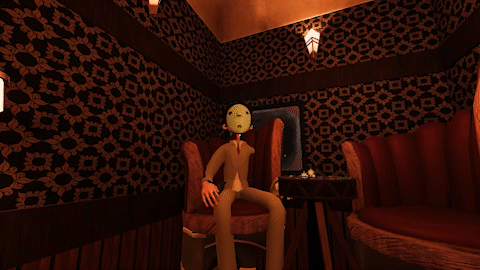
Hiding

Getting Caught

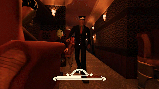
If you get caught by the inspector he will rip your ticket. Meaning that if you get caught again you will lose for real. It is like a second chance. So in order to tell the player that, I made a very dramatic animation of the ticket being ripped so that the player cant oversee it.
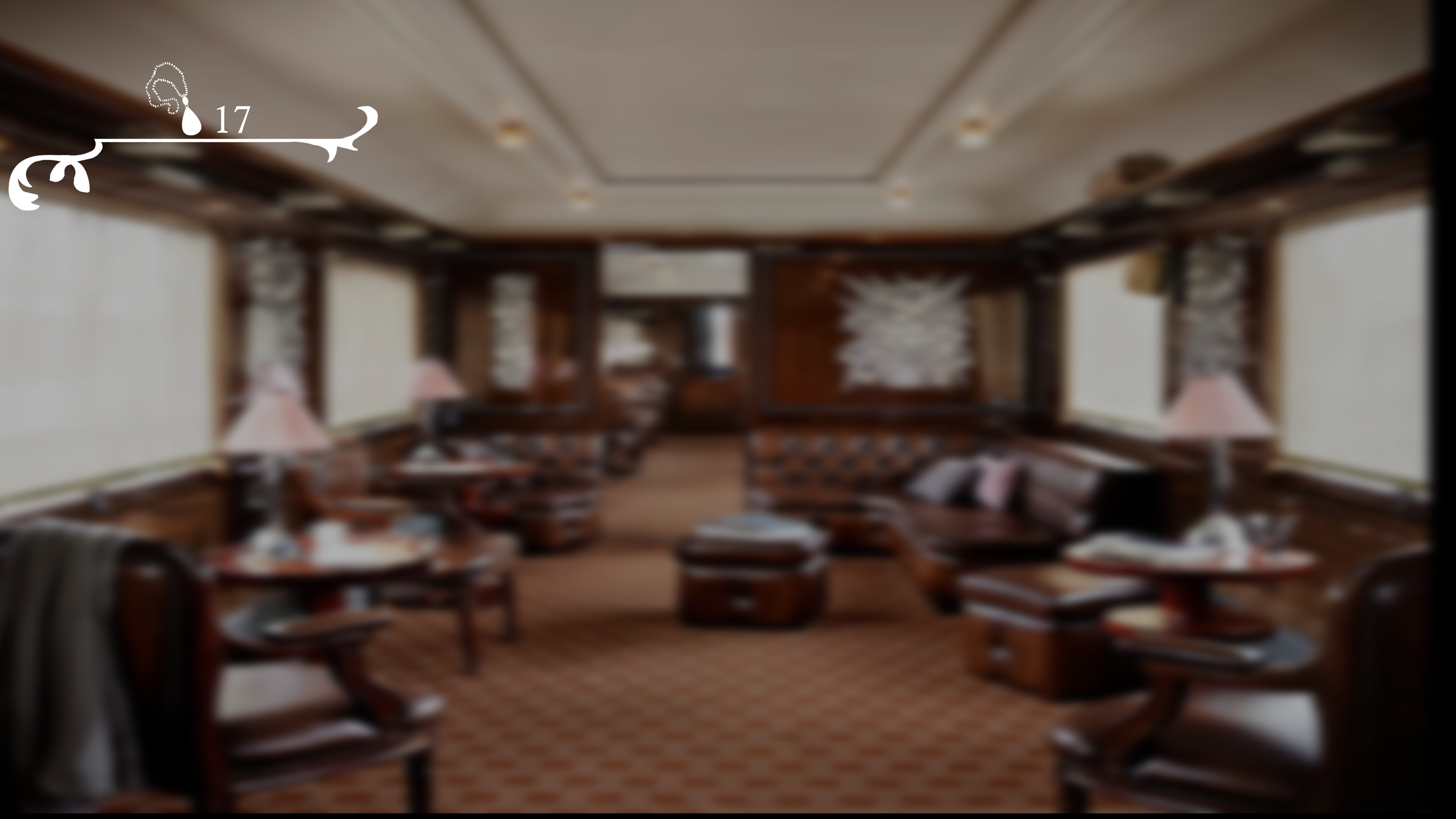
Current Position

1st rough sketch

Clean version
simplified final version
The Players were confused by all the numbers displayed in the UI that show the current position. The short amount of time the Ui is visible when entering a new compartment also didn't help that.
So I decided to only keep the Number of the current wagon and the number of the current class of the compartment. Furthermore, I narrowed the wagons displayed down to only 1. Players could now see every important piece of information to them in one glance into the right top corner.

